Daily Yolk is a modern all day breakfast club built around slow mornings, golden yolks, and cozy brunch vibes. For this project, I designed a menu that captures the brand’s warm, trendy personality through bold typography and bright colors. The result is a menu experience that feels fresh, comforting, and made for brunch lovers any time of day.
Visual Design
Figma, Photoshop
6 weeks
I was tasked with creating promotional material for any brand of my choice. While exploring ideas, I scrolled past a design brief challenge for a brunch spot called Daily Yolk. The brand's warm, modern vibe stood out to me. The original brief focused on creating a menu card and branding, but I decided to put my own twist on it by designing a full menu brochure instead. This gave me the freedom to expand the brand's visual identity.
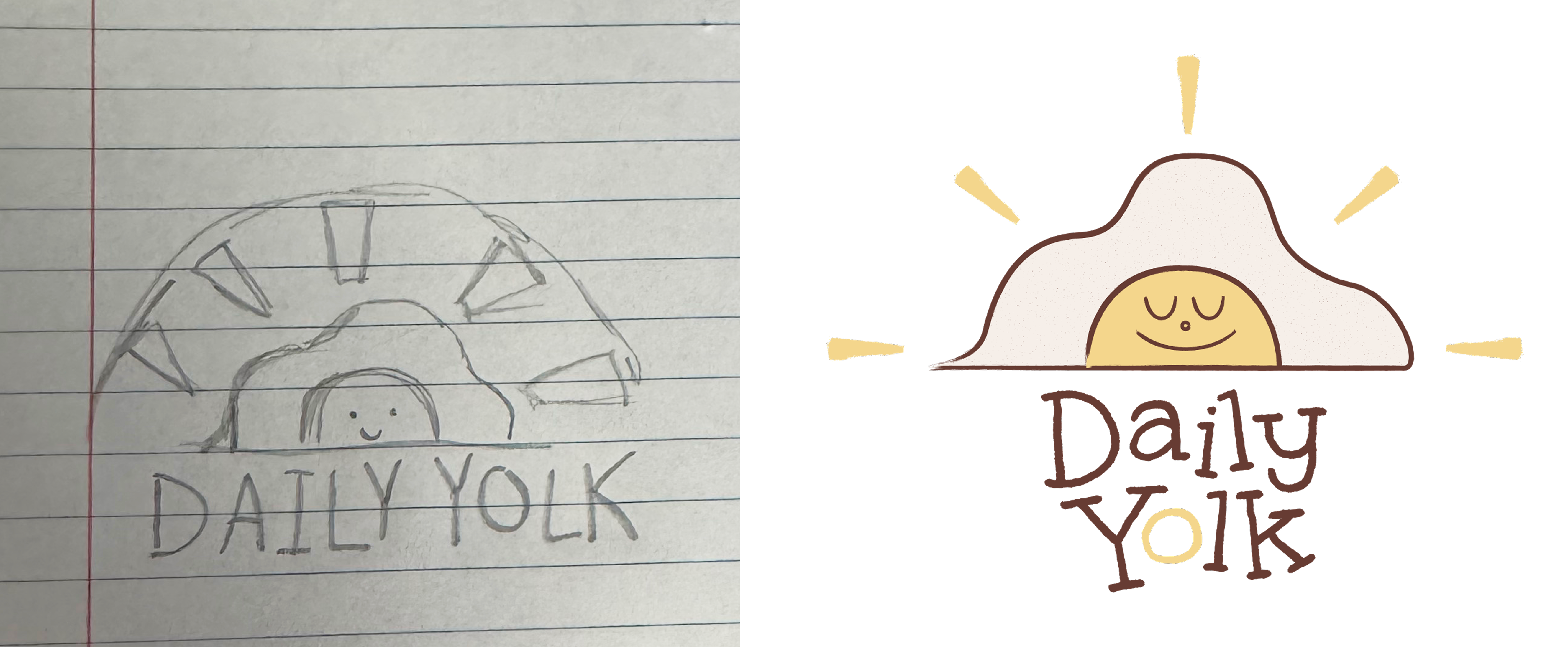
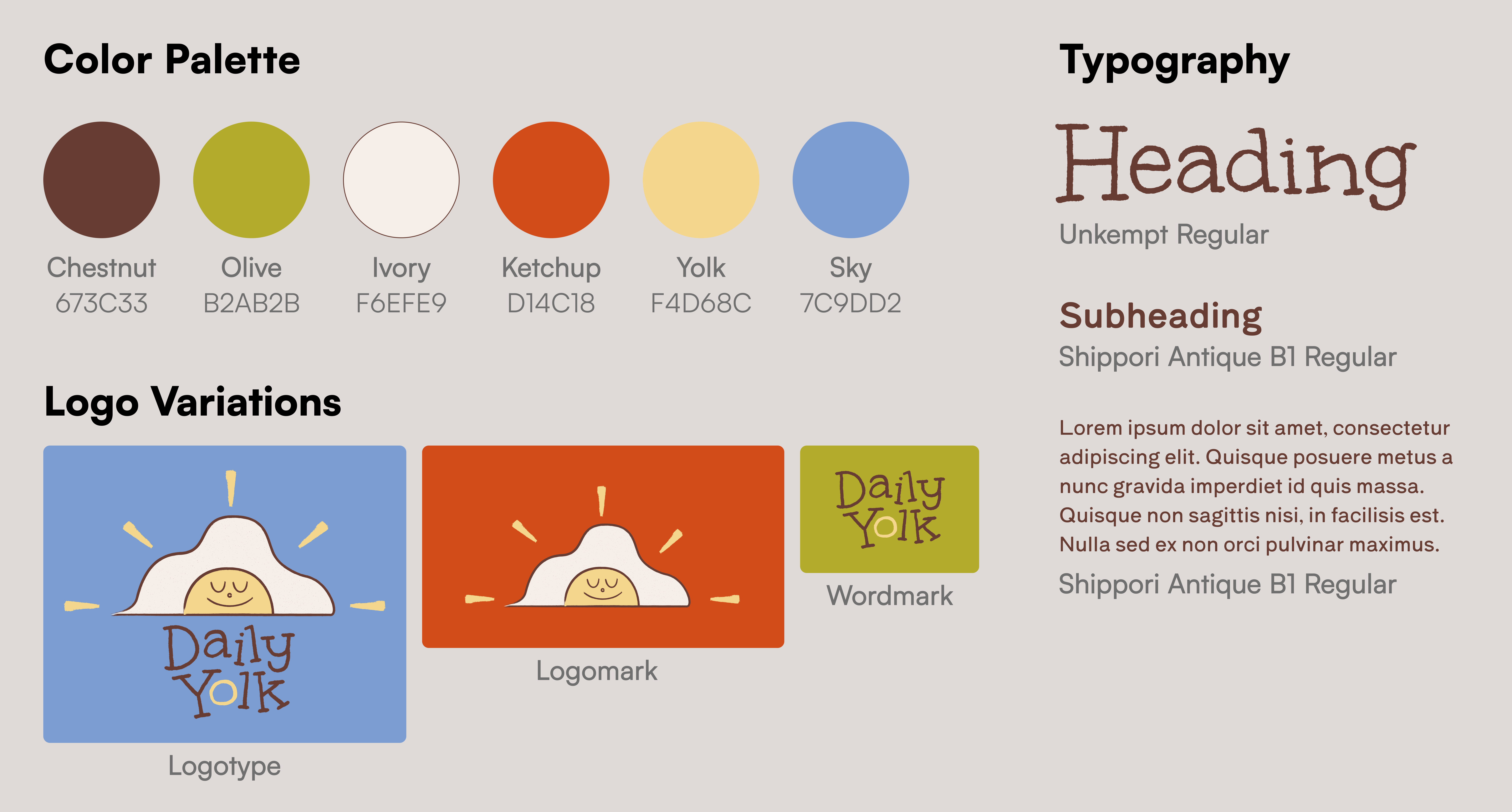
I wanted to create a bold and memorable mark that captures the brand's playful personality. I sketched out different figures representing eggs until I found a design that felt friendly and fun while still being modern.
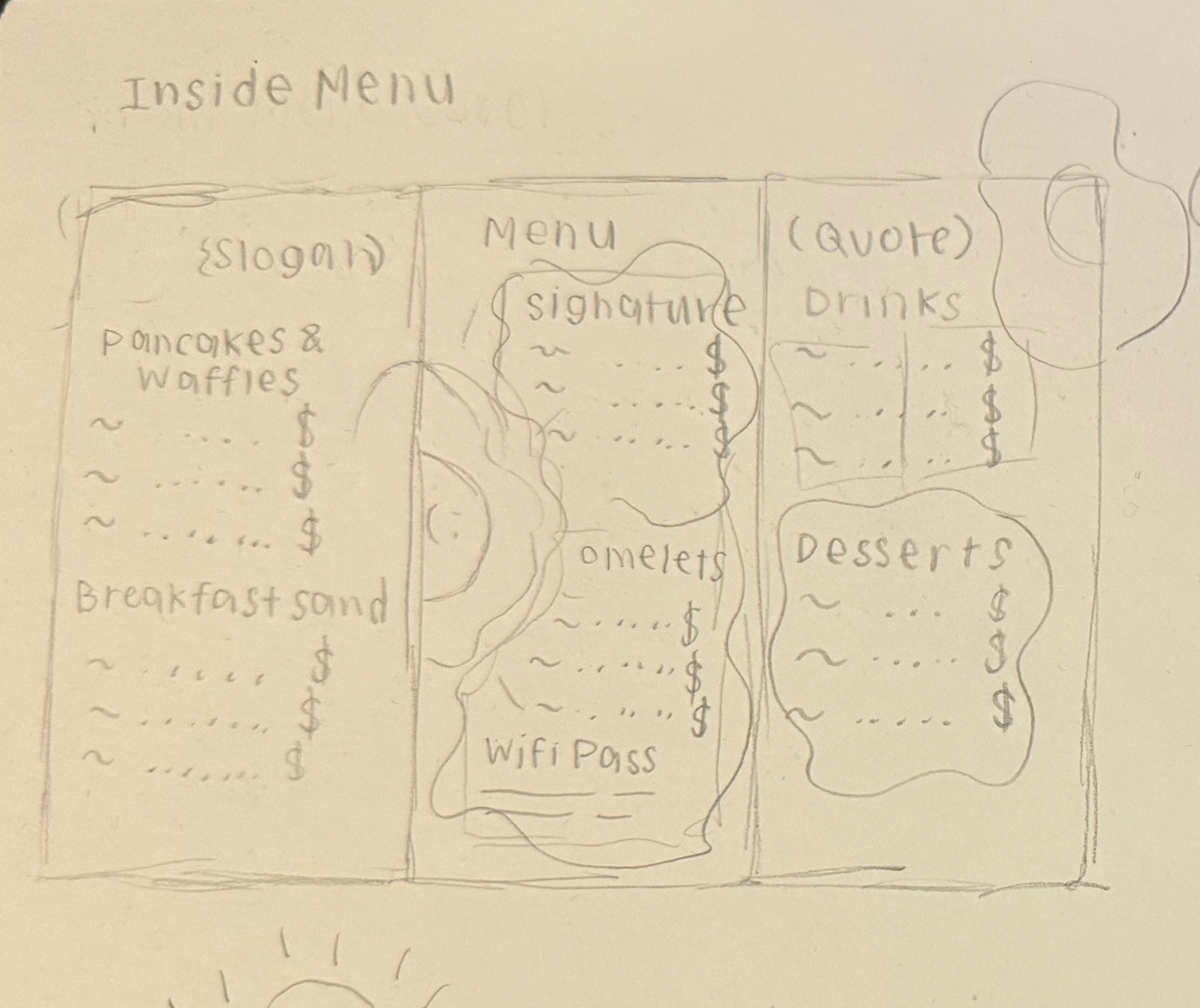
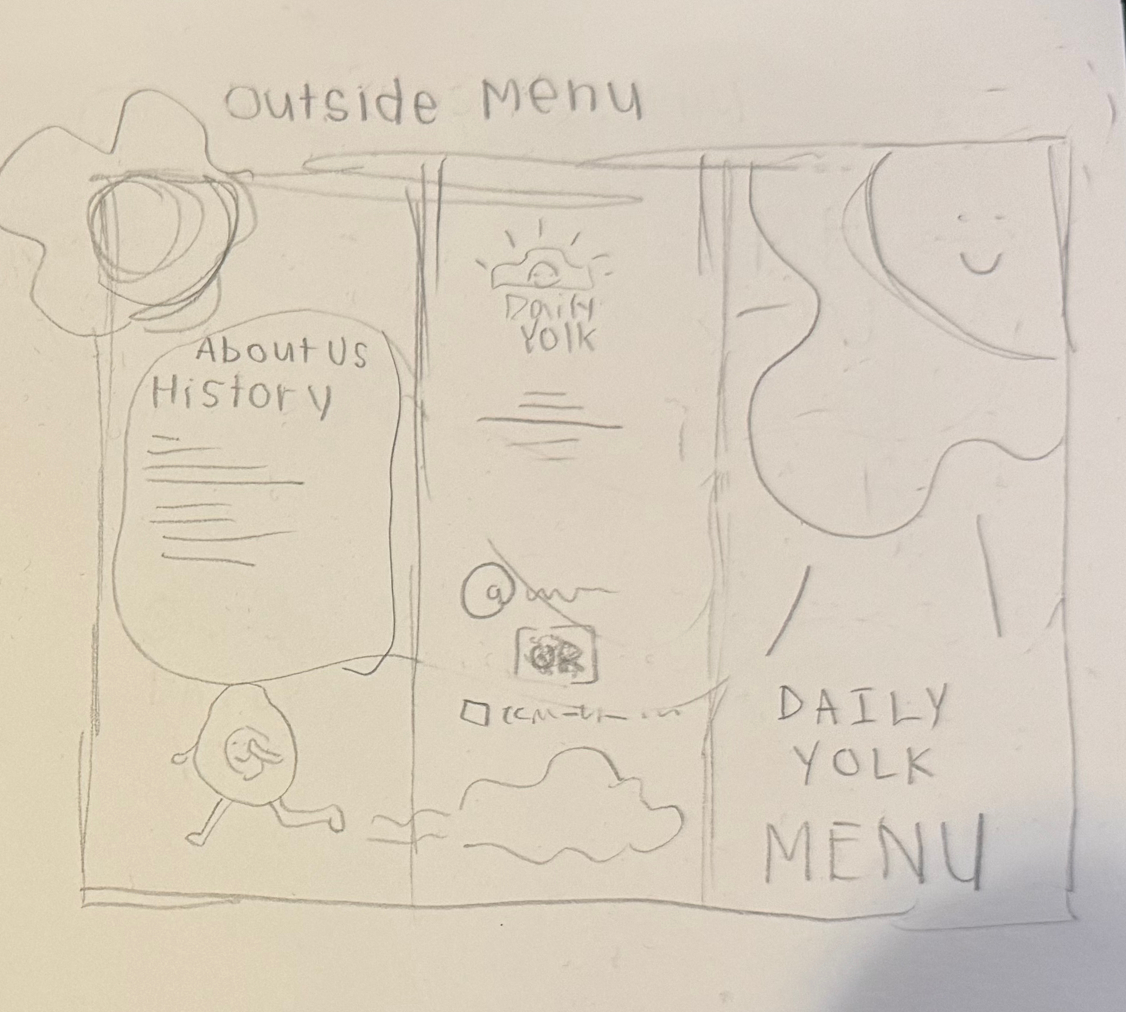
Before I sketched out my menu, I found lots of inspiration off of Pinterest. Then, I listed out all the sections I wanted to include in my menu: signature plates, desserts, drinks, and other food. I created rough thumbnail sketches to explore different ways of arranging them on the page. I experimented with layout hierarchy, spacing, and where to place key items so the menu would feel balanced and easy to read.
My direction with this project leaned into a bright, cheerful color palette to represent that burst of energy you feel after eating a good breakfast. The bright blues and soft yellow helps capture both the calmness of a slow morning and the vibrance of the morning sun. I used rounded shapes, soft shadows, and playful illustrations to help communicate a youthful and welcoming identity. Together, these elements make the menu feel approachable and fun.
Inside the menu, the layout prioritizes readability and flow. For each category, I separated them using color blocks and distinct headers. This establishes hierarchy to make it easy for customers to browse their food options. In addition, I used organic shapes behind images and text to add movement and mimic the natural, scattered look of a plate of food. Images of food are placed near the middle menu sections to guide the eye through the menu.
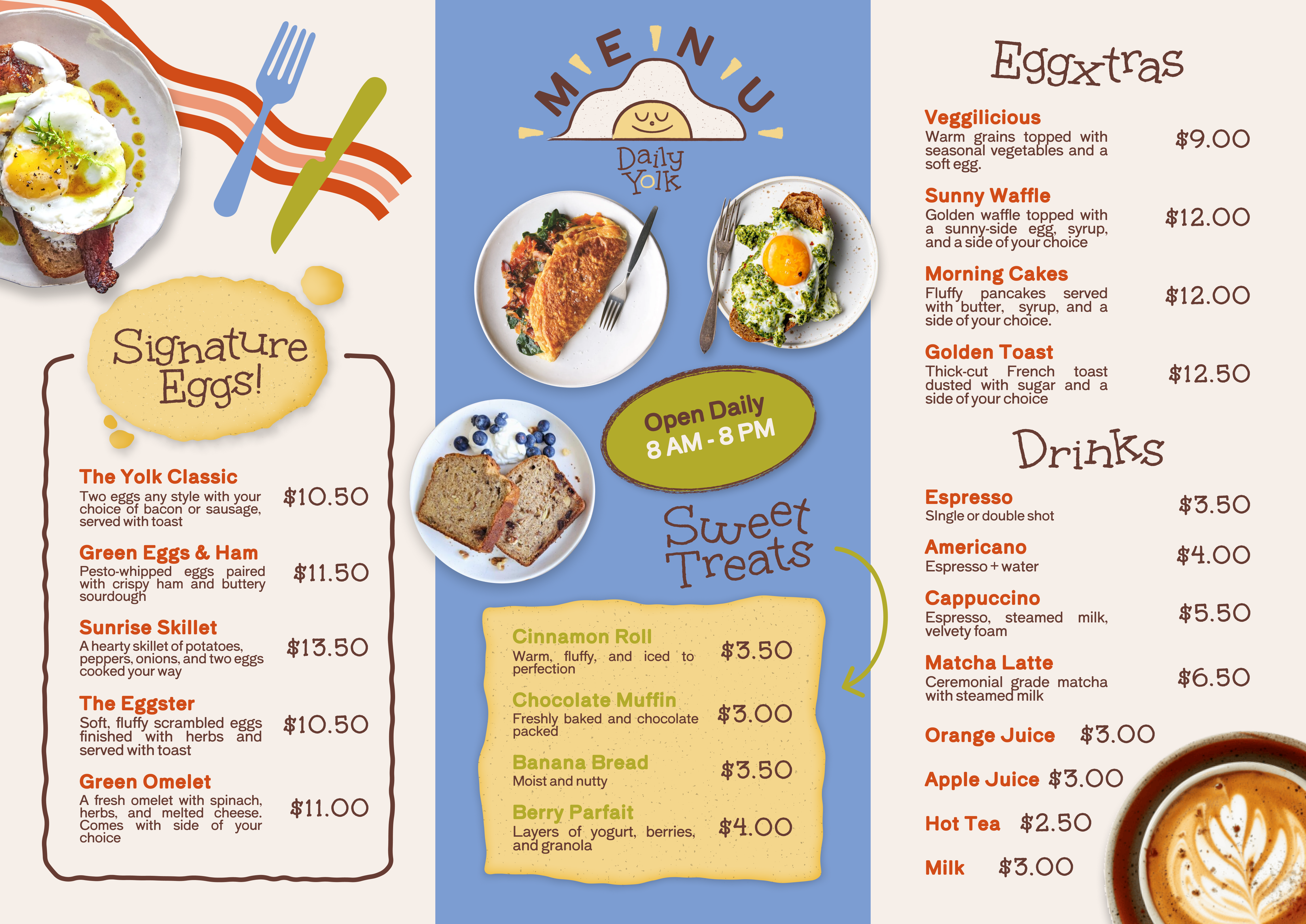
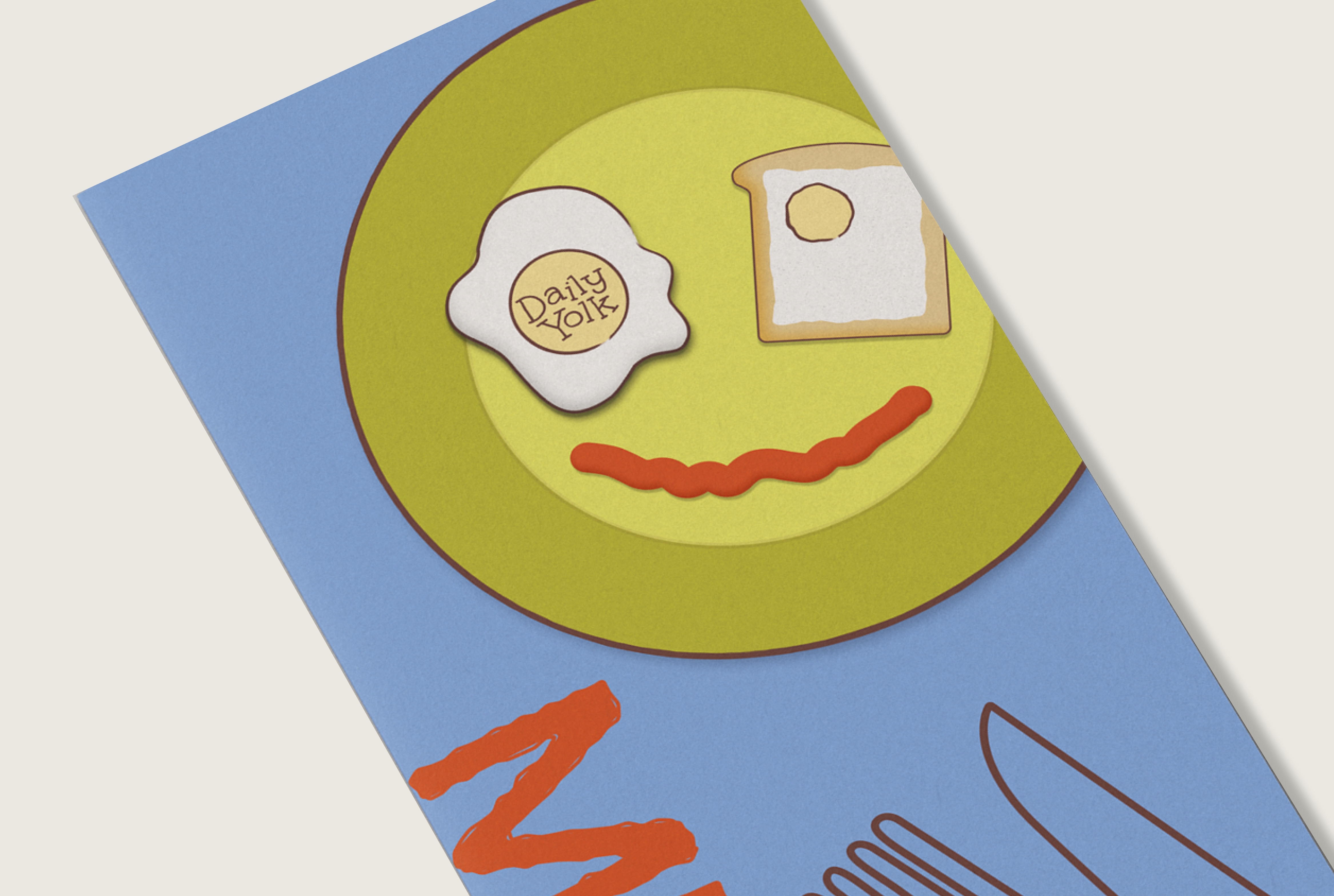
The front cover features a bold illustrated plate with eggs and toast arranged in a smiley face. This sets a friendly and playful tone for the brand’s personality. I added vector images of utensils and a vertical “MENU” to create a strong visual hierarchy that tells people what the purpose of the brochure is.
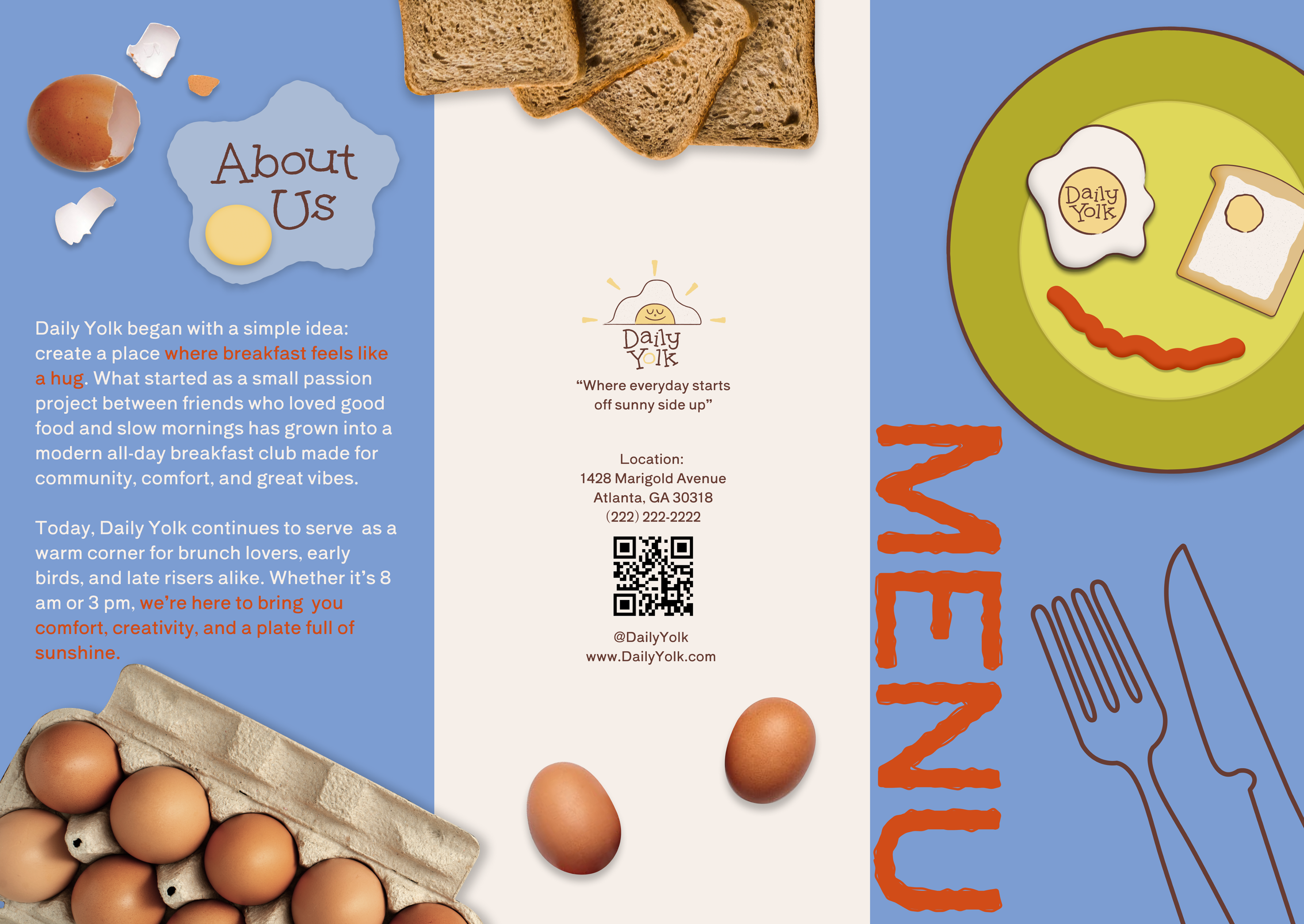
The “About Us” section portrays the cozy and warm feeling with icons and soft textures. The addition of realistic egg imagery connects with the whole restaurant being centered around eggs. I included a small QR code to modernize the experience and provide easy access to online menus or social media. This supports Daily Yolk’s identity as a contemporary breakfast spot that values both aesthetic and convenience.
Overall, my goal for this project was to create a menu that feels as comforting and joyful as the food it represents. The brochure blends playful illustration, bright colors, and a dynamic layout to deliver an inviting experience that reflects what Daily Yolk is all about: good vibes, good mornings, and golden eggs!
